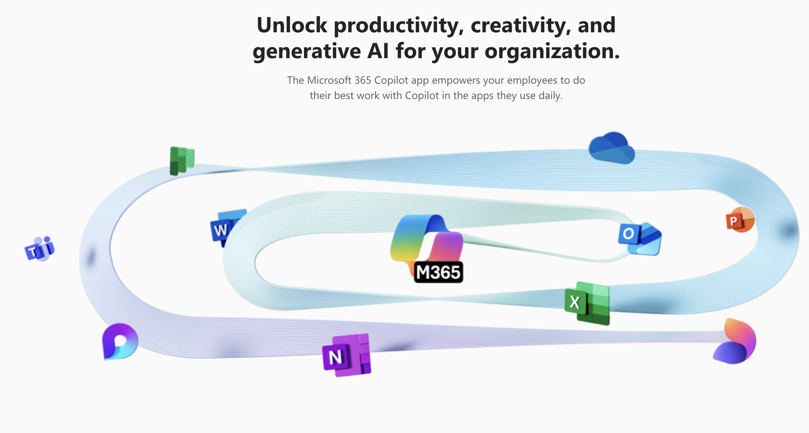
Redmond, Washington – Microsoft has officially rebranded its iconic Office suite to Microsoft 365, signaling a shift toward a more integrated productivity experience powered by AI. The change, which affects applications like Word, Excel, and PowerPoint, is part of Microsoft’s broader push to integrate its Copilot AI assistant across its suite of apps and services. However, the update has sparked mixed reactions, particularly due to the introduction of a new app icon for Copilot that has been criticized for being difficult to read on certain displays.
Microsoft 365: A New Era of Productivity
The rebranding, announced earlier this month, replaces the decades-old Office branding with Microsoft 365. According to XDA Developers, the change reflects Microsoft’s commitment to modernizing its productivity tools with AI-driven features that help users automate repetitive tasks, summarize documents, and improve workflow efficiency. The updated branding is already rolling out across apps on Windows, macOS, and mobile platforms.
The centerpiece of this update is Copilot, Microsoft’s AI assistant designed to provide real-time support across its productivity apps. Whether drafting emails in Outlook or analyzing data in Excel, Copilot aims to enhance productivity by acting as a personal assistant embedded within the software. Microsoft has emphasized that the rebranding and AI integration align with its vision for a more collaborative and intelligent workplace.
The Icon Controversy
While the rebranding has been largely welcomed, the introduction of a new icon for the Copilot app has stirred significant debate. The icon, described by some users as overly minimalist and difficult to discern on low-resolution or small displays, has drawn criticism from the tech community. Windows Central noted that the design, which features faint gradients and indistinct lines, struggles to stand out among other app icons on the taskbar or home screens.
Users have taken to social media to voice their frustrations, with some calling for Microsoft to revise the icon to improve legibility. “The icon doesn’t represent the innovation Copilot promises; it’s confusing and easy to overlook,” one user tweeted. Microsoft has acknowledged the feedback and indicated it is “monitoring user responses” but has not yet committed to making changes.
A Divided Reaction
Despite the criticism over the icon, Microsoft’s focus on AI integration has received praise for its potential to transform productivity. Digital Trends highlighted that features like automated content summaries and intelligent meeting notes have been well-received by early adopters, demonstrating the practical benefits of AI in day-to-day tasks.
However, critics argue that the emphasis on branding and iconography could distract from the substantive improvements Copilot brings to the table. Others have pointed out that while the AI features are promising, their usefulness heavily depends on continued refinement and user adaptation.
Looking Ahead
Microsoft 365, complete with its AI-powered Copilot, represents a bold step forward in the company’s efforts to redefine productivity. As Microsoft continues to roll out updates and respond to user feedback, it remains to be seen whether the controversial design choices will overshadow the transformative potential of its AI-driven tools.
For now, Microsoft appears committed to its vision of a more intelligent and integrated workspace, even if the path to user satisfaction includes a few missteps along the way.


